When I shifted to Graphic design I was able to glide in, serving my clients with the same freedom towards the same intention: Attracting attention to my clients product, event or course.
With thousands of typefaces styles out there, I'm one of thousands that see in type as another motif source.
Today when asked to choose and analyse my likes and dislikes in type styles, I decided to approach this practical art from two different angles: the reader on one hand and then the designer.
What was mentioned in the Helvetica documentary, rings so true: a successful typeface will be an invisible communication tool, because when I tried to recall what was most comfortable to me as a reader of a variety of books and magazines, I wasn't able to pinpoint a typeface.
for this reason, I flickered through some magazines at home and while reading books about typography to increase my awareness of it's practical role in graphic design. I found myself more comfortable with the classic typefaces like Times Roman and Century, Later on while reading, it was mentioned that it's a fact: Serif typefaces are more reader friendly than Sans Serif.
Although reading all this information in a book is new to me, it's practical effect isn't, I often fined myself grinning with a silent ( Oh Yeah ) ; )

One old style typeface I favor is Times New Roman ... the name released by the British Monotype Corporation who later on, with Linotype who called this new typeface: Times Roman, released the rest of the typeface family, and the newspaper refers to it as ( The Times New Roman ), all names are correct.
It's classified as a Dutch old style design, based on Plantin typeface, which is driven from an older typeface ( Granjon ).
Created in 1929 first used in 1932, by Victor Lardent, an artist working in ( The Times ) newspaper, rendering Stanley Morison's idea, who was at that time the typographic advisor to The newspaper.

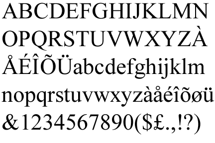
Morison's idea was to create a totally new design, the design must be beautiful, highly legible, heavier and larger but must not take up more space than the existing one.
The new design had it's own gracefulness, serifs had been sharpened, strokes became wider and character curves where refined.
Un like most typeface designs which are called after their designer, times new roman was called after the newspaper it was created for.
What I like about Times New Roman is it being a familiar friendly reliable face I know for a long time, like father Christmas or my primary school teacher, who face I remember, always telling us whats best for us in a trusting whey.
I also like the harmony between Times New Roman's sharp angles and serifs which don't start or end abrupt, and the curves of the lower case letters lead the readers eye smoothly from one word to another all through the paragraph.
At first, when Times New Roman was a new release it wasn't popular, but today it's widely used in many applications adding to politics, we fined it used in book publishing's, the legal and education systems.

As a designer in general, slim and tall attracts my attention, it's the element of highness, greatness and elegance.
An element evident in other arts like Roman architecture and calligraphy


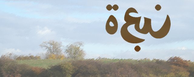
Londonderry Air is one of many typeface design styles that stick's out in the croud of modern elegance.
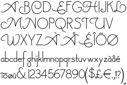
Based on Canterbury by (ATF) American Type Founders, the dominant American manufacturer of metal type from its creation in 1892.
Londonderry Air typeface, created in 2002 by Nick Curtis, a graphic designer from Chicago, Illinois, born 1948, has been passionately interested in typography ever since he discovered a typeface book in his early teens.


My fondness of this typeface is based on those long slim stems, ascends and descends and how they leave the main body of the letter leading the eye to the next one, like a smoothie blend, you just don't want to walk away from it.
It's strength is in the space each character occupies, again the harmony between sharp angles and curves in each character, with the lower case being restricted to the x - height, Curtis managed to maintain the grand spaces inside the character with ascends and descenders making their own impressions, it simply spells : gracefulness.
It's weakness is in it's size, it takes up a lot of space making it not suitable for full pages, this typeface is useful in logos, headlines and captions.
Another weakness is that it can be used for certain subjects like poetry, invitation cards and happy events.
Nick Curtis
His first exposure to typography as a disciplined field happened when he was thirteenth, stumbling in a neighborhood alley, on a treasure that someone else had thoughtlessly discarded, he found a big binder from Jaggers-Chiles-Stovall Typographers from Dallas, Texas. Inside were hundreds of typefaces – mostly practical and many exotic, with names like Orplid, Umbra and Venus. Curtis took the treasures home. This typeface binder became like a bible, an inspiration for many inroads into the hand lettering profession.
In high school, Curtis was active in the newspaper and the yearbook, learned the ABC's of practical graphic design, and continued that involvement into college and beyond, effected by Push Pin Studios, Art Deco influences and the San Francisco rock poster movement who borrowed heavily from Art Nouveau.

Art Deco Fonts

Art Deco poster design

Art Nouveau Poster Design

Growing up in the 1950s when commercial television in the United States was still relatively young. A lot of the programming in those days where movies and cartoons from the 1930s many of them are examples of Art Deco advertising, architecture and furnishings.
He tried his hand at poster design and did some of his first type design sketches. freeware font ( Nickelodeon ) was taken from drawings he did in a notebook in 1969
His career path included: graphic design in a computer company, an advertising agency, an audio-visual presentation company, and broadcast television and in 1990, Nick Curtis filled a post in the electronic pre-press graphic arts field.
In 1997 Curtis began his first attempts into font creations, In 2000, he notice that Bitstream was soliciting font designs for their New Font Collection, so I sent them a few of my designs. I was elated when they chose to license Steppin’ Out and Picayune Intelligence.
Emboldened by my new found success, I submitted several designs to ITC. In 2001, they licensed twelve of my designs, and their parent company, Agfa-Monotype, licensed another three. Two of those designs – ITC Jeepers and Agfa-Monotype Woodley Park – were honored by the Type Directors Club of New York as among the best new type designs of 2001, I was gratified.
establishing my own independent foundry, Nick’s Fonts in 2003
having more than 200 typeface designs in his C.V and many more will come
when he was asked,What is your favorite typefaces among the creations of your peers ?
I would have to say that Greg Thompson’s Bodega series is my all-time favorite. Both the serif and sans-serif versions are marvelous exercises in minimalism – not a single extraneous point or line. Other favorites include Daniel Pelavin’s ITC Anna (serious Art Deco), and Jim Parkinson’s ITC Jimbo series (just plain fun).

