9 Feb 2009

Crtical Debates in Design: Animated Digital Media Design

Animation is on of the most important creative creations of the twenty first century, a visual world of fantasy, where there is no impossible.
The word animate comes from the Latin verb animare, meaning “to make alive or to fill with breath.” Animation, by modern definition, “is the rapid display of a sequence of 2-D artwork images or model positions in order to create an illusion of
movement.

It's an approach, an aesthetic and an application that informs many aspects of visual culture. Animation is here,there and everywhere ... from feature length films to prime time sit Com's, from television and web cartoons to display functions of new communication technologies., I can confidently say that it's the new generation of (sign form) of the modern age.


Like every story of success, many in Europe and in the United States claim the writs to it's invention, the history of animation is still being researched, one theory suggests that the roots go back to the industrial revolution in the 1800s, that contributed to the evolution of press technology, making it possible to add images to news paper contents, cartoon caricature was introduced, The word can be traced back to the 17th century, when Italian artist ( Agostino Carracci ) drew so-called “ritratti caricati”, absurd portraits and figures, literally translated: overloaded portraits, mocking societies interests and news headlines.


I remember, at school with friends, we tryed something similar to this flip book ( kineograph ) but simpler ...


Early attempts of animation came in several individual efforts, Many devices and gadgets which bore strange names as: Thaumatrope, Stroboscope, Phenakistoscope, The Wheel of Life, Kinetograph and many others.
In 1825 Dr. John Ayrton Paris created the ( Thaumatrope ): a card disc with a picture of a bird on one side and a birdcage on the other, when the disc was twirled by two strings attached to opposite edges.
The viewer's eye retained the image of one side as the other side was revealed ...
The result was that the two images became as one : the bird appeared to be in the cage


In 1832, the Belgian physicist Joseph Plateau invented the ( Phenakistoscope )
: a revolving paper disc which has a number of figurs pictured in different stges of movement spaced around it, when viewed through a mirror, thy appear to be one moving image.


Plateau's invention inspired many other devices, in the last quarter of the 19th century, when the inventions of the Kinematoscope by Coleman Sellers of Philadelphia and William E. Lincoln’s Zoetrope were great advances leading to the motion picture.


Then came Emile Reynaud in 1892 with his Theatra Optique


The big breakthrough came in March 1895, when Auguste and Louis Lumiere successfully projected live action motion pictures onto a screen with their ( Cinematograph ) in Paris then again at Marlborough Hall in London.
The Lumiere brothers are regarded the earliest film makers, who managed to combine the complex organization of a camera with that of a projector.
At this stage, there was little distinction in the public eye between live action film and animated drawings, since the essence of both was movement


The first specialisation strands
that emerged whent in three directions:
* Straight Cinema, also referred to as ( live-action film ).
* Animated films and cartoons, using the ( stop-motion technique: of photographing each stage of movement separately).
* Trick photography: which is a combination of both, creating live-action film with animated optical effects added.
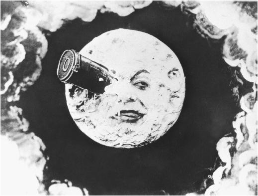
Cinematigraph became popular when it's value was recognised as an entertainment medium, in 1902 the film ( VOYAGE TO THE MOON ) starring Georges Melies was released.


The British Arthur Melbourne Cooper produces the worlds first animated commercial in 1899, a stop motion film of moving matchsticks titled ( Match Appeal )
In 1906 James Stuart Blackton produces his film ( Humorous Phases of Funny Faces ), being the first to combined live, trick and animated techniques. Blacktons second film ( The Haunted Hotel ) released in 1907, included new effects and tricks, was imported by the french, watched by 5000 Parisian audience.


During the first two decades of the twentieth century, animators quickly learned new techniques to exploit this medium, creating memorable cartoon characters like Winsor McCay's ( Little Nemo in Slumberland ) 1911 and ( Gertie the Dinosaur ) 1914, McCay is also credited for being the first to make an animated documentary ( The Sinking of the Lusitania ) 1915.

At this stage , the USA and European animation started to develop apart
, with the USA winning the international race to shape this new time consuming, costly medium, their creativity overshadowed the Europeans concepts based on local characters and simple technologies.

Felix the Cat 1919 cartoon, similar to news paper cartoon caricature, the first cartoon to introduces visual mocking punning gags, which appealed to intellectual audiences, as did cartoon character ( Betty Boop 1932, a sex symbol tailored to image of Hollywood stars


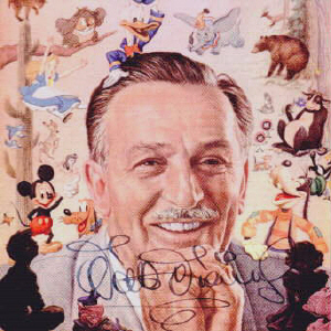
Walt Disney ... the golden age of American cartoon

the most popular animation studio up to date, starting out in the late 1920's creating characters that have stud the test of time, becoming icons all age groups relate to: Mickey Mouse, Pluto, Goofy and Donald Duck.



Animation and the digital age

Working as a TV Graphic animator, I've witnessed how accessible the development of digital technologies has made animation, not easy to create and not hard to learn at the same time,if a person has the passion for it. With a click of the mouse, the limits are sky high when it comes to the ability to experiment, change and remake the design, adding to the accidents that tern out to be a pleasant surprise.
With animation, I managed to tern dull and dry subjects with contents that lack images or video rushes, into interesting eye catching visuals that manage to attract attention. It's a magical world of constant disciplined change.

The many applications where animation came in as a solution include

* Media
* Television
* Advertising
* Music
* Web Design
* Games
* Innovative Marketing
* Conferences
* Communication
* Documentaries
* Business Presentations
* Military services
* Education
* Crime investigations
* Medical observation
* Whether forecasts
* Maps/ whey finding


TV Graphics


Whether forecasts


What does the future hold for us in animation

I really cannot say ...

I hope it remains a blessing, not turns into a curse, the bad side affect to the digital privileges we are enjoying, such as Games, Face book, My space and other virtual society communities, are keeping us in touch, but still lonely, becoming harder and less human to each other, because at the end of the day, we are all alone facing a screen.

My favorite animated cartoon ...

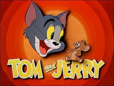
Tom and Jerry

I love the chase, the art of war between the two, but we all know that they can't live without each other, it's a love hate equation, often used as a metaphor ....

Those two ... are like Tom and Jerry
; )

4 Feb 2009

Critical Debates in Design: Enviromental Sign System

Signs of Life

Living the modern urban world, signs lead us every where, we nearly never stop and admire how accurate they are in helping us find our whey around. what ever we do through the day, part of the process we must have used or responded to a sign, an icon or a pictogram, on our mobile, on the train or bus, and we just cannot get on the net without pressing on icons and pictogram.
The impact signs have on our life is to guide us to safety through direct messages, some give us directions or warnings, others carry a request or dictate a ban, all towards one aim, to decrease harm or injury, whether it's our health or our assets or time management.

History of Pictograms

Pictogram are a modern invention, first written symbols were pictorial representations of objects, the earliest known written systems are originated in the middle east, Cuneiform in Mesopotamia and Hieroglyphs in Egypt 5000 years ago.
no one knows why people started to communicate with pictogram and symbols, one theory suggests that merchants wanted to record transactions in a permanent form.
China can trace back a long continuous line of cultural evolution , as a result, it's visual form of communication that has hardly changed, from the stone age to the present day, making it the longest continuously used language system of symbols.
Because of the rapid global developments through transport and technology, bringing world cultures closer together, a demand has increased for new specialized forms of communications for people of diverse languages and backgrounds.
The first pictorial symbols agreed to internationally, were traffic signs adopted in 1909 by France, Austria, Belgium, Bulgaria, Germany, Italy, Monaco, Spain and Britain.


The Olympic Games having a global impact always brought together whole nations, in order to organize and communicate facts to visitors about different sports and general information, abstract systematically geometrical images were used, and it was the Tokyo Olympics of 1964 that introduced the present concept of pictograms. Later on, Olimpic pictograms were gradually refined into simplified stylized forms, developed to such a modrenized degree, we can confidently describe them as perfect.


Semiotics: The Study of Signs

Asign is an overall concept : everything that, on the grounds of a previosly established social convention, can be taken a standing for smething else.
Signs can be visual, auditory or tactile. Signs are icons ( illustrations ), symbols ( representations ) and index ( indicator ).
A pictogram is a pictorial representation, an iconic sign which represents complex facts through visual carriers of meaning, created for the purpose of quick and clear communication without language or words, the motif should be culurally neutral, communicating with instant and basic human reaction, in order to draw attention to something important.

At the Gym

The Gym is an active environment, full of fiscal effort based on rapid movement, equipped with machines designed that enhance body stamina towards fitness and body tone, thus full of hazard and risk of angry. Therefor each piece of equipment has it's own explanatory sign or group of signs ( family ), that complete each other


Strength Training: upper and lower body workout

The signs in this category are all pictograms, picturing instructions on how to correctly use each piece of equipment, and what parts of the human body will benefit. The designer used the human body as the center point of interest,with simple out lines and mild colors, only using a bold color when needed to point out the impotent function or effect it will cause.
The design is so well researched, that no words are needed to farther explain. The typed information appears only to add to the regular persons knowledge of body anatomy, which is an extra.


Bench workout explanatory Pictogram & Treadmill cardio Diagram


Danger


At the Gym
What I find is a fault in this set of pictograms, is that they are a bit dull. The gym is a pleasant place to go to and after a workout session, a person feels quite content, energetic and positive, and that is not apparent in those signs, making the workout seam like an obligation,they are not inviting.


At the Gym


At the Gym


At the Gym


At the Gym


At the Gym


27 Jan 2009

Critical Debates in Design : typefaces

Starting out as a Textile designer, detail is the thing that has it all: Weight, Proportion, Expand, condense,Texture, Style ... it's the art of decoration with a lot of free space for the designer to be creative.
When I shifted to Graphic design I was able to glide in, serving my clients with the same freedom towards the same intention: Attracting attention to my clients product, event or course.
With thousands of typefaces styles out there, I'm one of thousands that see in type as another motif source.
Today when asked to choose and analyse my likes and dislikes in type styles, I decided to approach this practical art from two different angles: the reader on one hand and then the designer.
What was mentioned in the Helvetica documentary, rings so true: a successful typeface will be an invisible communication tool, because when I tried to recall what was most comfortable to me as a reader of a variety of books and magazines, I wasn't able to pinpoint a typeface.
for this reason, I flickered through some magazines at home and while reading books about typography to increase my awareness of it's practical role in graphic design. I found myself more comfortable with the classic typefaces like Times Roman and Century, Later on while reading, it was mentioned that it's a fact: Serif typefaces are more reader friendly than Sans Serif.
Although reading all this information in a book is new to me, it's practical effect isn't, I often fined myself grinning with a silent ( Oh Yeah ) ; )


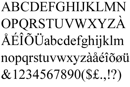
One old style typeface I favor is Times New Roman ... the name released by the British Monotype Corporation who later on, with Linotype who called this new typeface: Times Roman, released the rest of the typeface family, and the newspaper refers to it as ( The Times New Roman ), all names are correct.
It's classified as a Dutch old style design, based on Plantin typeface, which is driven from an older typeface ( Granjon ).
Created in 1929 first used in 1932, by Victor Lardent, an artist working in ( The Times ) newspaper, rendering Stanley Morison's idea, who was at that time the typographic advisor to The newspaper.


Morison's idea was to create a totally new design, the design must be beautiful, highly legible, heavier and larger but must not take up more space than the existing one.
The new design had it's own gracefulness, serifs had been sharpened, strokes became wider and character curves where refined.
Un like most typeface designs which are called after their designer, times new roman was called after the newspaper it was created for.
What I like about Times New Roman is it being a familiar friendly reliable face I know for a long time, like father Christmas or my primary school teacher, who face I remember, always telling us whats best for us in a trusting whey.
I also like the harmony between Times New Roman's sharp angles and serifs which don't start or end abrupt, and the curves of the lower case letters lead the readers eye smoothly from one word to another all through the paragraph.
At first, when Times New Roman was a new release it wasn't popular, but today it's widely used in many applications adding to politics, we fined it used in book publishing's, the legal and education systems.


As a designer in general, slim and tall attracts my attention, it's the element of highness, greatness and elegance.
An element evident in other arts like Roman architecture and calligraphy


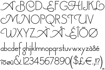
Londonderry Air is one of many typeface design styles that stick's out in the croud of modern elegance.


Based on Canterbury by (ATF) American Type Founders, the dominant American manufacturer of metal type from its creation in 1892.
Londonderry Air typeface, created in 2002 by Nick Curtis, a graphic designer from Chicago, Illinois, born 1948, has been passionately interested in typography ever since he discovered a typeface book in his early teens.


My fondness of this typeface is based on those long slim stems, ascends and descends and how they leave the main body of the letter leading the eye to the next one, like a smoothie blend, you just don't want to walk away from it.
It's strength is in the space each character occupies, again the harmony between sharp angles and curves in each character, with the lower case being restricted to the x - height, Curtis managed to maintain the grand spaces inside the character with ascends and descenders making their own impressions, it simply spells : gracefulness.
It's weakness is in it's size, it takes up a lot of space making it not suitable for full pages, this typeface is useful in logos, headlines and captions.
Another weakness is that it can be used for certain subjects like poetry, invitation cards and happy events.

Nick Curtis
His first exposure to typography as a disciplined field happened when he was thirteenth, stumbling in a neighborhood alley, on a treasure that someone else had thoughtlessly discarded, he found a big binder from Jaggers-Chiles-Stovall Typographers from Dallas, Texas. Inside were hundreds of typefaces – mostly practical and many exotic, with names like Orplid, Umbra and Venus. Curtis took the treasures home. This typeface binder became like a bible, an inspiration for many inroads into the hand lettering profession.
In high school, Curtis was active in the newspaper and the yearbook, learned the ABC's of practical graphic design, and continued that involvement into college and beyond, effected by Push Pin Studios, Art Deco influences and the San Francisco rock poster movement who borrowed heavily from Art Nouveau.


Art Deco Fonts


Art Deco poster design


Art Nouveau Poster Design


Growing up in the 1950s when commercial television in the United States was still relatively young. A lot of the programming in those days where movies and cartoons from the 1930s many of them are examples of Art Deco advertising, architecture and furnishings.
He tried his hand at poster design and did some of his first type design sketches. freeware font ( Nickelodeon ) was taken from drawings he did in a notebook in 1969
His career path included: graphic design in a computer company, an advertising agency, an audio-visual presentation company, and broadcast television and in 1990, Nick Curtis filled a post in the electronic pre-press graphic arts field.
In 1997 Curtis began his first attempts into font creations, In 2000, he notice that Bitstream was soliciting font designs for their New Font Collection, so I sent them a few of my designs. I was elated when they chose to license Steppin’ Out and Picayune Intelligence.
Emboldened by my new found success, I submitted several designs to ITC. In 2001, they licensed twelve of my designs, and their parent company, Agfa-Monotype, licensed another three. Two of those designs – ITC Jeepers and Agfa-Monotype Woodley Park – were honored by the Type Directors Club of New York as among the best new type designs of 2001, I was gratified.
establishing my own independent foundry, Nick’s Fonts in 2003
having more than 200 typeface designs in his C.V and many more will come
when he was asked,What is your favorite typefaces among the creations of your peers ?
I would have to say that Greg Thompson’s Bodega series is my all-time favorite. Both the serif and sans-serif versions are marvelous exercises in minimalism – not a single extraneous point or line. Other favorites include Daniel Pelavin’s ITC Anna (serious Art Deco), and Jim Parkinson’s ITC Jimbo series (just plain fun).